Flutter 中 可以给Container设置decoration来设置背景,边框等等效果,非常方便。
1
2
3
| Container(
decoration: TestDecoration(),
);
|
但是Flutter自带的decoration比较少,只能支持常规样式,当我们需要设置特殊背景时,就满足不了我们的需要了。
这时候,就有必要自定义一个我们定制化的decoration。
搜了一下flutter sdk代码,发现flutter里有一个定制化的FlutterLogoDecoration类,用这个FlutterLogoDecoration可以生成一个flutter logo样式的decoration。
我们可以参考它的代码来写一个我们自定义的decoration。
经过我的分析,自定义decoration的步骤还是很简单的。
一个简单的代码框架是这样的。
1
2
3
4
5
6
7
8
9
10
11
12
13
14
15
16
17
18
19
20
21
22
|
class MyDecoration extends Decoration {
  @override
  BoxPainter createBoxPainter([VoidCallback onChanged]) {
    return _MyBoxPainter(this);
  }
}

class _MyBoxPainter extends BoxPainter {
  final TestDecoration myDecoration;
  final Paint painter;

  _MyBoxPainter(this.myDecoration)
      : painter = Paint()

  @override
  void paint(Canvas canvas, Offset offset, ImageConfiguration configuration) {
    //我们需要实现的代码
    //具体绘制decoration的内容
  }
}
|
这段代码中,我们主要需要实现的,就是_MyBoxPainter的paint方法。
上面的的代码,是先写了一个MyDecoration类继承Decoration,然后重写了其中的createBoxPainter方法,创建一个_MyBoxPainter类。
_MyBoxPainter类是继承BoxPainter的,里面的paint方法需要我们实现,在该方法中具体编写decoration实际绘制的内容。
绘制时,主要用到了canvas.draw...相关的api。
下面是一份带有红色边框,和内部有“测试”字样的decoration的demo代码。
1
2
3
4
5
6
7
8
9
10
11
12
13
14
15
16
17
18
19
20
21
22
23
24
25
26
27
28
29
30
31
32
33
34
35
36
37
38
39
40
41
42
43
44
45
|
class MyDecoration extends Decoration {
  @override
  BoxPainter createBoxPainter([VoidCallback onChanged]) {
    return _MyBoxPainter(this);
  }
}

class _MyBoxPainter extends BoxPainter {
  final MyDecoration testDecoration;
  final Paint painter;

  _MyBoxPainter(this.testDecoration)
      : painter = Paint()
          ..color = Colors.red
          ..strokeWidth = 2;

  @override
  void paint(Canvas canvas, Offset offset, ImageConfiguration configuration) {
    var size = configuration.size;
    Offset leftTop = offset;
    Offset rightTop = leftTop.translate(size.width, 0);
    Offset leftBottom = leftTop.translate(0, size.height);
    Offset rightBottom = leftTop.translate(size.width, size.height);

    canvas.drawLine(leftTop, rightTop, painter);
    canvas.drawLine(leftTop, leftBottom, painter);
    canvas.drawLine(rightTop, rightBottom, painter);
    canvas.drawLine(leftBottom, rightBottom, painter);

    var textPainter = TextPainter(
      text: TextSpan(
        text: "测试",
        style: TextStyle(
          backgroundColor: Colors.green,
          color: Colors.red,
          fontSize: 12,
        ),
      ),
      textDirection: TextDirection.ltr,
    );
    textPainter.layout();
    textPainter.paint(canvas, (leftTop + rightBottom) / 2);
  }
}
|
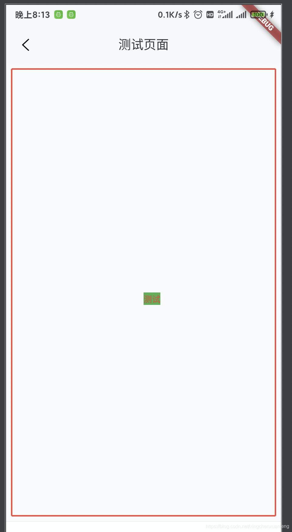
这里设置了painter的颜色是红色,宽度是2,用来绘制边框。
paint方法的Offset offset参数表示控件左上角的位置。
configuration.size 可以得到控件的宽高。
所以,
1
2
3
4
| Offset leftTop = offset;
Offset rightTop = leftTop.translate(size.width, 0);
Offset leftBottom = leftTop.translate(0, size.height);
Offset rightBottom = leftTop.translate(size.width, size.height);
|
通过上面这四行代码,就可以得到控件四个角的位置。
1
2
3
4
| canvas.drawLine(leftTop, rightTop, painter);
canvas.drawLine(leftTop, leftBottom, painter);
canvas.drawLine(rightTop, rightBottom, painter);
canvas.drawLine(leftBottom, rightBottom, painter);
|
然后通过drawLine可以绘制四个边框。
这里是演示demo,实际要绘制边框可以使用canvas.drawRect(rect, paint)方法更为方便。
1
2
3
4
5
6
7
8
9
10
11
| var textPainter = TextPainter(
text: TextSpan(
text: "测试",
style: TextStyle(
backgroundColor: Colors.green,
color: Colors.red,
fontSize: 12,
),
),
textDirection: TextDirection.ltr,
);
|
这里定义了一个“测试”文字绘制的painter,文字颜色是红色,底色是绿色,字号是12,文字方向是从左到右。
需要注意的是,需要先调用textPainter.layout(); 才能真正绘制,否则会报错。
调用textPainter.paint(canvas, (leftTop + rightBottom) / 2); 即可完成绘制。(leftTop + rightBottom) / 2)表示绘制在中心位置。
总体来说代码很简单,只要按照这个框架实现对应的方法即可。
主要是用了canvas.draw...相关的api 和 TextPainter.paint方法。